Twitter: We see the introduction of a fresh logo and image for a well-known brand almost every month. The hazards of rebranding, however, are not usually known by businesses. The agencies in charge of the rebranding are curiously also in danger. As Elon Musk has now announced the rebranding of Twitter, The iconic blue bird will be removed and the Logo will be changed into an ‘X’. Will it work or will the company turn to dust?
In this article, we will share rebranding examples after which the companies failed.
Brands that changed their logos and failed
1. GAP
GAP, a clothing company, debuted its new logo on October 6, 2010. Sales fell off after the 2008 financial crisis, which came before this. Then, numerous brands encountered comparable problems. GAP believed a rebranding might be the answer to their issue, though. The new logo, however, ended up being a failure.
2. Pepsi
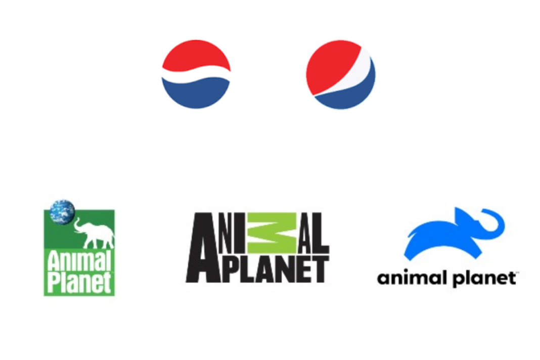
Pepsi’s designers created a new logo in 2014 after 5 months of “hard” effort and $1 million in expenses. Strong criticism was levelled at this new logo for the redesign.
Attempting in vain to put smiles on people’s faces, the iconic Pepsi globe was now twisted to one side. The white portion of the emblem was also varying in size based on the type of product.
The new logo was inconsistent in addition to being unoriginal!
Customers of Pepsi were dissatisfied, and its attempt at rebranding led to a marketing failure.
3. Animal Planet
Animal Planet’s viewers weren’t exactly delighted when the network chose to alter its logo in 2018. Except for the “M” standing upside down and in green, the iconic green emblem with the elephant and the globe has been simplified and now just consists of black letters. The early 2000s’ biggest logo failure, according to many, was this one. As a result, the new emblem had no resemblance to the previous one and did not convey the company’s principles or guiding principles. Furthermore, the public did not understand the animal channel’s explanation of the rebranding logo and the principles it should stand for.
DON'T MISS
Because of this, Animal Planet made the decision to return to its roots in 2018, while also giving them a contemporary spin. The company’s current logo has a blue elephant leaping, with the words “Animal Planet” boldly printed below it.
4. Hershey’s
Hershey’s, more formally The Hershey Company, a maker of sweet chocolate candies, made the decision to rebrand in 2009. Unfortunately, quite a few criticisms and jokes about its new “fail” logo have been made online. Why change, was the main objection raised? They have been prospering for more than 120 years as a well-known chocolate manufacturer with a rich history. They ultimately came up with a logo that might resemble a smoking poop. When purchasing chocolate, this is not what you want to consider initially. Hence, Hershey’s failed with their rebranding.
5. MasterCard
Mastercard made the decision to work on enhancing its logo design in 2015.Even though Mastercard’s corporate logo is among the most recognisable in history, the business thought it needed revamping.
In the past, the corporate name was positioned front and centre in the logo. After revamping, Mastercard completely removed its name from the logo. The new Mastercard logo not only exhibited poor branding but also confused customers. In the end, the business developed a new logo, although corporate communications continued to use the 2015 version.
Keep watching our YouTube Channel ‘DNP INDIA’. Also, please subscribe and follow us on FACEBOOK, INSTAGRAM, and TWITTER


