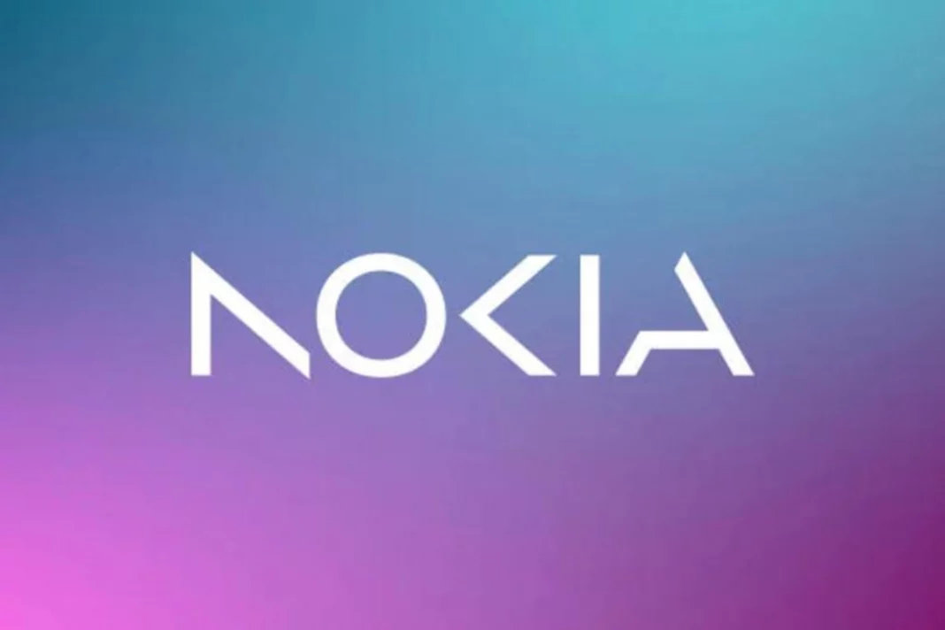
Nokia: The global Finnish telecommunications company Nokia announced plans to rebrand itself on Sunday for the first time in 60 years. The telecom unveiled a new logo that emphasises aggressive growth in this competitive sector.
Also Read: Nokia launches 3 new smartphones, All you need to know about these amazing smartphones
New Nokia Logo
In an effort to encourage worldwide expansion, Nokia has introduced a new brand identity, which includes a new logo. For the first time in nearly 60 years, Nokia has changed its logo. The word “NOKIA” is formed in the new logo in five different shapes. The new logo has a variety of colours based on its intended purpose, unlike the former blue colour scheme.
DON'T MISS
Why the New logo?
“There was the association to smartphones and nowadays we are a business technology company.” ekka Lundmark, chief executive, said in an interview with a news organisation.
The logo, which appears to be part of a new corporate strategy was announced a day before the annual Mobile World Congress (MWC2023), in which the company will unveil the business update. The annual event opens in Barcelona on Monday and runs until March 2.
Lundmark has set out a strategy with three stages: reset, accelerate and scale; the second stage is beginning, with the reset stage now complete.
Although some of you might believe it, Nokia is no longer a player in the phone industry. The term Nokia is only a brand, whereas HMD Global is the company that makes the phones sold under the Nokia name.
Keep watching our YouTube Channel ‘DNP INDIA’. Also, please subscribe and follow us on FACEBOOK, INSTAGRAM, and TWITTER.


